

Card Link to this heading
The card shortcode renders a general-purpose preview card with a title, description, optional image or icon, and metadata.
| Parameter | Description |
|---|---|
title | Required. Card heading text. |
url | Optional. Link target for the whole card. |
desc | Optional. Description text shown below the title. Supports HTML. |
image | Optional. Thumbnail image URL. Falls back to a placeholder icon when omitted. |
icon | Optional. Icon name shown inline before the title. |
metaText | Optional. Metadata content shown below the description. Supports HTML. |
Example
{{< card
  title="Getting Started"
  url="https://example.com"
  desc="Description."
  image="/img/01.webp"
>}}Article Card Link to this heading
The article shortcode generates a visual preview card for a specified internal page.
| Parameter | Description |
|---|---|
path | Required. The logical path of the target internal page. |
desc | Optional. Whether the page description is displayed. |
meta | Optional. Whether the page metadata is displayed. |
lang | Optional. Get page from another language of your site. |
Example
{{< article path="/docs/40-getting-started" desc=true meta=false >}}GitHub Card Link to this heading
The github shortcode creates a dynamic preview card for a GitHub repository.
| Parameter | Description |
|---|---|
repo | Required. Format owner/repo. |
Example: Repository preview with thumbnail
{{< github repo="gohugoio/hugo" >}}Email Link to this heading
The email shortcode obfuscates an email address to reduce exposure to scrapers. The address is base64-encoded at build time and decoded client-side into a mailto link.
| Parameter | Description |
|---|---|
address | Required. Email address. |
Example
{{< email address="hello@example.com" >}}Embed Code Link to this heading
The embed-code shortcode fetches source code from a remote URL and renders it as a highlighted code block.
| Parameter | Description |
|---|---|
url | Required. The absolute URL of the remote source file. |
type | Optional. The programming language for syntax highlighting. |
lines | Optional. Line range in start-end format (e.g. 3-7), or a single line number. Omit to include the entire file. |
Example: Fetching specific lines from GitHub
{{< embed-code url="https://raw.githubusercontent.com/githubtraining/hellogitworld/refs/heads/master/src/main/java/com/github/App.java" type="java" lines="3-7" >}}/**
* Hello again
* Hello world!
* Hello
*/Embed Markdown Link to this heading
The embed-md shortcode fetches and renders remote Markdown content. This shortcode must be called with markdown notation ({{/*% %*/}})
| Parameter | Description |
|---|---|
url | Optional. The absolute URL of the Markdown file. |
page | Optional. The logical path of the target internal page. |
Example
Include an external page:
{{% embed-md url="https://github.com/ZhenShuo2021/hugo-yore/raw/refs/heads/main/README.md" md=false %}}Include an internal page:
{{% embed-md page="/docs/shortcodes/40-math/index.md" %}}Fig Link to this heading
The fig shortcode renders an image inside a <figure> element with a figcaption that supports footnotes. Use it only when the caption needs a footnote, otherwise use standard Markdown image syntax.
| Parameter | Description |
|---|---|
src | Required. Image path. |
alt | Optional. Alt text for the image. |
caption | Optional. Caption text shown in the figcaption. |
attrs | Optional. Raw HTML attributes applied to the <figure> element. |
Example
{{% fig
  attrs="class='center-cap center-img' style='width:50%'"
  src="/img/04.webp"
  alt="alt"
  caption="*1234*[^fn_a]"
%}}

[^fn_a]: Footnote text.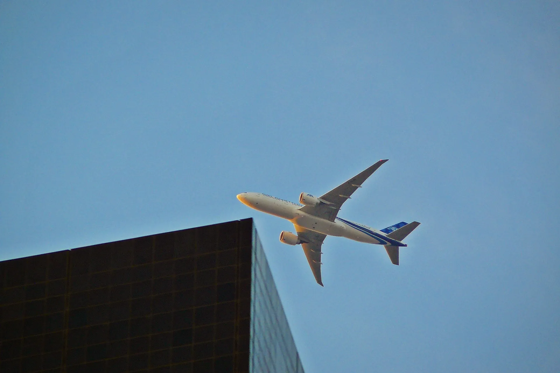
12341
This is equivalent to the standard markdown image syntax below, but the syntax does not support footnotes.

{class="center-cap center-img" style="width:50%"}Float Link to this heading
The float shortcode wraps arbitrary content with text flowing around it, floating left or right with configurable width.
| Parameter | Description |
|---|---|
side | Optional. Float direction, start or end. Default: start |
size | Optional. Float width, s, m, or l. Default: m |
Example:
{{% float side="end" %}}

{{% /float %}}Use {{% float-clear %}} to cancel the float effect.
Cols Link to this heading
cols shortcode allows you to create flexible multi-column layouts with custom widths and optional responsive behaviors. Note that it uses markdown notation ({{% %}}).
| Parameter | Description |
|---|---|
widths | Optional. Comma-separated list of column widths (e.g., 30%,70%). If not specified, columns are evenly distributed. |
rwd | Optional. Responsive web design (rwd) controls responsive behavior. When true, columns stack vertically on small screens and display horizontally on larger screens. Default: true |
{{% cols widths="70%,30%" rwd=false %}}

<!-- cell -->
Nemo enim ipsam voluptatem quia voluptas sit aspernatur aut odit aut fugit.
{{% /cols %}}
Nemo enim ipsam voluptatem quia voluptas sit aspernatur aut odit aut fugit.
Carousel Link to this heading
The carousel shortcode displays an image carousel with a main viewport, navigation buttons, and a scrollable thumbnail strip. The inner content uses YAML format to define images.
Images can be specified individually with src, or batch-loaded with match.
| Parameter | Description |
|---|---|
src | Optional. YAML path to the image configuration file. Takes precedence over the shortcode's inner content. |
ratio | Optional. Aspect ratio of the slide frame, in x/y format. Default: 4/3 |
fit | Optional. How images fill the frame. contain shows the full image (may letterbox); cover crops to fill. Default: contain |
thumbs | Optional. Whether to show the thumbnail strip. Default: true |
arrows | Optional. Whether to show the previous/next buttons. Default: true |
counter | Optional. Whether to show the slide counter. Default: true |
YAML fields per item:
| Field | Description |
|---|---|
src | Image path. |
match | Glob pattern to batch-load images. See Match (external link) for more details. |
caption | Optional. Caption text displayed below the main image. |
alt | Optional. Alt text for accessibility. Falls back to caption if omitted. |
Example 1: fit="cover" arrows=false
{{< carousel ratio="32/9" fit="cover" arrows=false >}}

- match: /img/*[5-7]* # 05, 06, 07
- src: /img/drop.svg
  caption: carousel caption
  alt: carousel alt

{{< /carousel >}}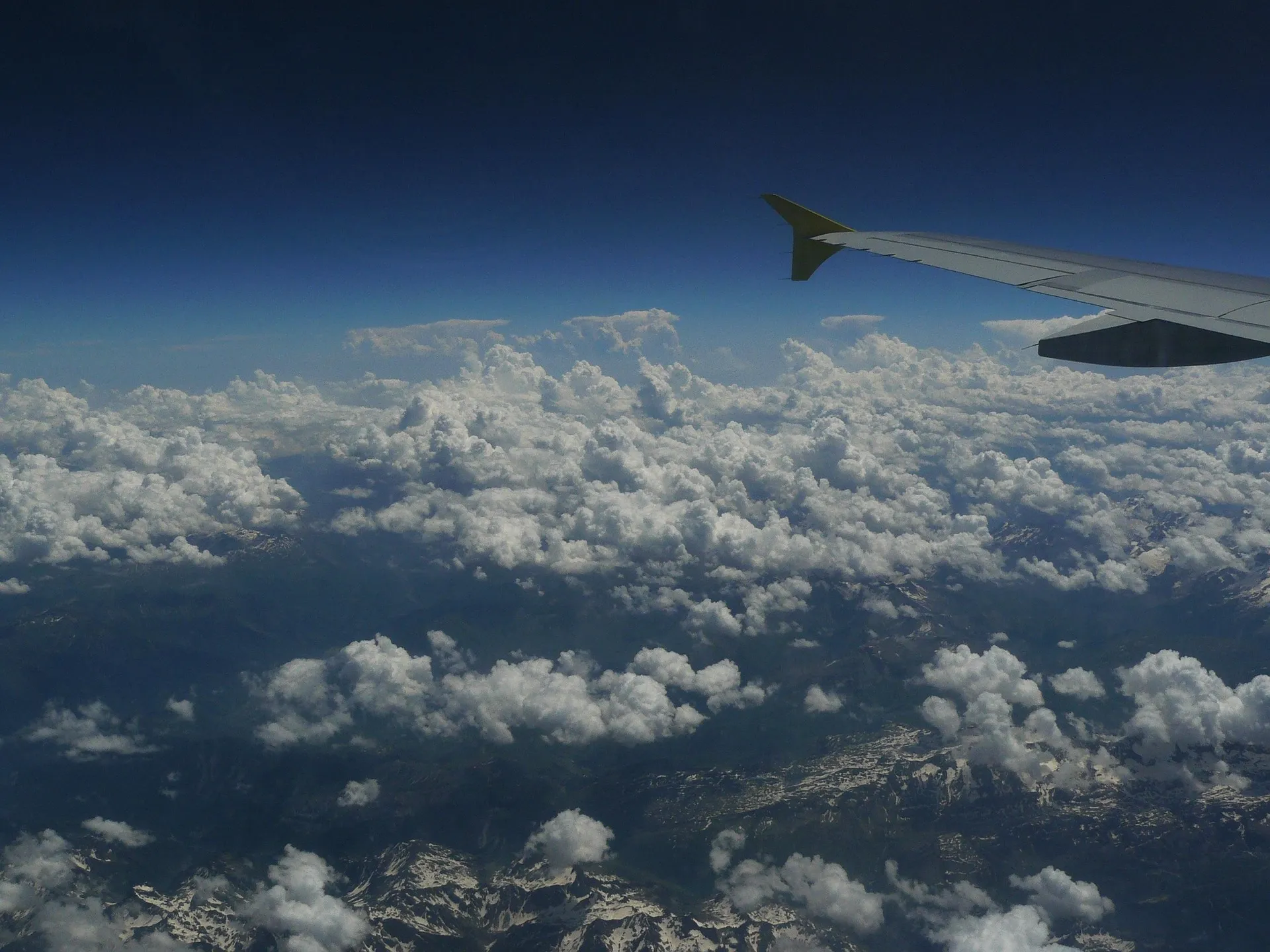
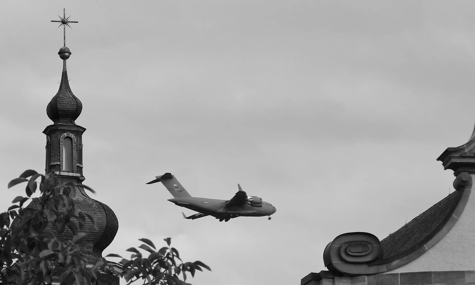


Example 2: thumbs=false counter=false
{{< carousel ratio="32/9" thumbs=false counter=false >}}

- match: /img/*[5-7]* # 05, 06, 07
- src: /img/drop.svg
  caption: carousel caption
  alt: carousel alt

{{< /carousel >}}Masonry Link to this heading
masonry shortcode allows you to create a fluid, masonry-style image wall where items are arranged in columns with varying heights. The inner content uses YAML format to define images.
| Parameter | Description |
|---|---|
src | Optional. YAML path to the image configuration file. Takes precedence over the shortcode's inner content. |
maxCols | Optional. The maximum number of columns to display. Default: 3 |
Images can be specified individually with src, or batch-loaded with match.
YAML fields per item:
| Field | Description |
|---|---|
src | Image path. |
match | Glob pattern to batch-load images. See Match (external link) for more details. |
caption | Optional. Caption text displayed below the image. |
alt | Optional. Alt text for accessibility. Falls back to caption if omitted. |
width | Optional. Image width to prevent layout shift |
height | Optional. Image height to prevent layout shift |
Example
{{< masonry maxCols="3" >}}

- src: /img/02.webp
  alt: Fly high
  caption: Hello world!
- src: /img/03.webp
  alt: Contrails
- src: /img/04.webp
  alt: Parapet
- src: /img/05.webp
  alt: Wing
- src: /img/06.webp
  alt: Eaves
- src: /img/07.webp
  alt: Biplane sunset
- src: /img/drop.svg
  alt: SVG sample

{{< /masonry >}}

Icon Link to this heading
The icon shortcode renders an inline SVG icon from the theme's icon library.
| Parameter | Description |
|---|---|
0 | Required. Icon name. |
Example
{{< icon "activity" >}}
{{< icon "arrow-left-circle" >}}
{{< icon "clock" >}}
See all available icons in reference page.
Audio Link to this heading
The audio shortcode embeds a HTML5 audio player.
| Parameter | Description |
|---|---|
src | Required. Audio path. |
poster | Optional. Poster path. If omitted, the shortcode attempts a same-name image in the page bundle. |
alt | Optional. Alt text for the cover image. |
caption | Optional. Markdown caption shown below the player. |
autoplay | Optional. Enables autoplay when true. Default: false |
loop | Optional. Loops when true. Default: false |
muted | Optional. Mutes when true. Default: false |
controls | Optional. Shows the browser's default playback controls when true. Default: true |
preload | Optional. metadata (load info), none (save bandwidth), or auto (preload more). Default: metadata |
start | Optional. Start time in seconds. |
end | Optional. End time in seconds. |
ratio | Optional. Reserved aspect ratio for the cover image, only applied when poster is set. Supports 16/9, 4/3, 1/1, or custom W/H. Default: 1/1 |
fit | Optional. How the cover image fits the ratio: contain (no crop), cover (crop to fill), fill (stretch). Default: contain |
Example: Looped muted audio
{{< audio
  src="/audio/beep.mp3"
  caption="*beep*"
  loop=true
>}}Video Link to this heading
The video shortcode embeds a HTML5 video player.
| Parameter | Description |
|---|---|
src | Required. Video path. |
poster | Optional. Poster path. If omitted, the shortcode attempts a same-name image in the page bundle. |
caption | Optional. Markdown caption shown below the video. |
autoplay | Optional. Enables autoplay when true. Default: false |
loop | Optional. Loops when true. Default: false |
muted | Optional. Mutes when true. Default: false |
controls | Optional. Shows the browser's default playback controls when true. Default: true |
playsinline | Optional. Inline playback on mobile when true. Default: true |
preload | Optional. metadata (load info), none (save bandwidth), or auto (preload more). Default: metadata |
start | Optional. Start time in seconds. |
end | Optional. End time in seconds. |
ratio | Optional. Reserved aspect ratio for the player. Supports 16/9, 4/3, 1/1, or custom W/H. Default: 16/9 |
fit | Optional. How the video fits the ratio: contain (no crop), cover (crop to fill), fill (stretch). Default: contain |
Example: Autoplay muted video
{{< video
    src="https://upload.wikimedia.org/wikipedia/commons/5/5a/CC0_-_Public_Domain_Dedication_video_bumper.webm"
    caption="*Public domain demo*"
    loop=true
    muted=true
>}}PDF Link to this heading
The pdf shortcode embeds a PDF file using an inline iframe viewer.
| Parameter | Description |
|---|---|
src | Required. PDF URL or local path. Resolves as page resource first, then global resource, then relative URL. |
title | Optional. PDF title for screen readers. |
page | Optional. Jumps to a specific page number on load. |
height | Optional. Height of the viewer frame. Default: 800px |
YouTube Link to this heading
The youtube shortcode embeds an optimized YouTube video player.
| Parameter | Description |
|---|---|
id | Optional. YouTube video ID. |
params | Optional. URL parameters. |
Example: Specific video with start time
{{< youtube id="ldX1Ii0MofQ" params="start=30" >}}TypeIt Link to this heading
The typeit shortcode creates dynamic typewriter animations.
| Parameter | Description |
|---|---|
initialString | Optional. Text shown before animation. |
speed | Optional. Typing speed in ms. Default: 100 |
loop | Optional. Whether to restart. Default: false |
tag | Optional. HTML tag for wrapping. Default: div |
Example: Looping animation with custom speed
{{< typeit speed="50" loop="true" tag="h2" >}}
Yore - A Simple Yet Powerful Hugo Theme
{{< /typeit >}}
Footnote text. ↩︎